Don Jacobo: A new look for a new era
When a brand with a rich history decides to revamp its image, it never does so by chance. Behind every change lies a statement of intent, a way of looking to the future without forgetting the path travelled. That is precisely what the new visual identity of Don Jacobo conveys; it is one of Bodegas Corral’s flagship brands and a name deeply linked to the Rioja Qualified Designation of Origin.
This evolution demonstrates that the image of a Rioja wine can be modernised without compromising its authenticity. Because updating the design does not mean breaking with the past, but rather finding a new way to tell the same story.
A cleaner, more elegant and contemporary label
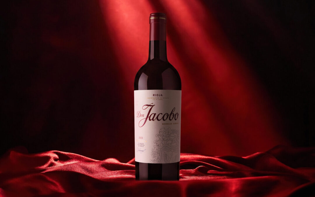
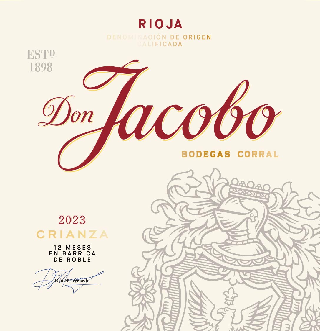
At first glance, Don Jacobo’s new look focuses on balance. The spotlight falls on the brand name, which stands out thanks to a large, distinctive calligraphic typeface. This design choice reinforces Don Jacobo’s identity and makes it more recognisable, making the name the label’s main visual element.
The white background adds brightness and creates a sense of visual clarity that makes the text easier to read. Compared to the more ornate labels commonly found in the world of traditional wine, this design breathes, organises the information and allows each element its own space.
The new label also features an illustration of the coat of arms of Don Martín Corral, the figure after whom the winery is named and who lent his coat of arms to serve as the brand’s identifying emblem. Subtly integrated into the design, this element adds visual depth and keeps alive the link to Bodegas Corral’s origins.
Fewer elements, more personality
Current trends in branding favour designs that communicate more with less. Don Jacobo has embraced this trend with a visual identity that eliminates visual clutter to highlight what really matters.
The technical information is still there, but it is organised more clearly. The vintage, ageing period and origin are all clearly presented without competing with one another, making it easier for consumers to quickly identify the wine’s key characteristics.
This approach also responds to a market reality: nowadays, purchasing decisions are often made in a matter of seconds. Whether on a shelf or in an online shop, a clear and recognisable label makes all the difference.
 A design also tailored to the digital environment
The evolution of Don Jacobo is not just about the physical bottle. It also responds to a context in which brands are constantly visible on screens.
On social media, online shops or digital publications, overly complex labels lose their legibility. However, a clean design, with a strong typographic identity and a simple layout, retains all its personality even when displayed in a small image.
It is a change that demonstrates how modern branding must work just as effectively on a restaurant table as it does on a mobile phone screen.
Tradition remains the starting point
Modernising an image does not mean abandoning its history. Quite the opposite.
The new identity retains clear references to Rioja, the wine’s origins and the legacy of Bodegas Corral. The classic elegance remains, albeit reinterpreted through a more contemporary visual language.
This balance is particularly important in a sector where consumer trust is built up over many years. A renewal that is too radical could sever the emotional bond with those who have known the brand for decades. Don Jacobo, however, manages to evolve whilst respecting the very qualities that have made it a benchmark.
A bottle that conveys quality even before it is opened
The enjoyment of wine begins long before the first sip. The bottle is the first point of contact between the brand and the consumer, and its design has a decisive influence on how the product is perceived.
The new look conveys sophistication, balance and attention to detail. It does not need to rely on eye-catching colours or graphic effects to grab attention. Instead, it achieves this through a serene composition, a well-executed visual hierarchy and a skilful use of white space.
The result is a bottle that projects confidence and consistently reflects the style of the wines it contains.
A natural step towards further growth
Major brands know that evolving is a necessity. The market changes, as do consumption patterns, and design must keep pace with that transformation.
With this new visual identity, Don Jacobo demonstrates that it is possible to modernise a historic brand without losing its essence. The new label retains the brand recognition built up over the years whilst incorporating a visual language designed to connect with new generations of consumers.
It is an evolution that does not seek to break with the past, but rather to reinforce everything that has always defined the brand: quality, authenticity and a close connection with Rioja.
If you’d like to find out more about this new chapter and discover the full range of wines, you can visit the Don Jacobo page in our online shop, where you’ll find information about its various wines and the philosophy behind this revamped image.
Because, ultimately, the best stories aren’t the ones that change completely, but those that know how to evolve whilst keeping intact what makes them unforgettable.